

Doors of London
- Ella's Books
- Apr 20
- 2 min read
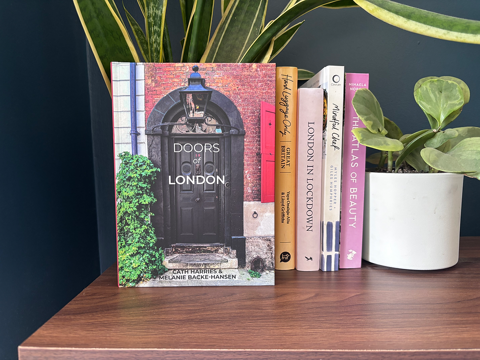
Working on Doors of London as both designer and illustrator was really about knowing when to step back. The concept is simple, celebrating London’s doors, but the execution relies on letting the photography take centre stage.
With hundreds of photos to work with, the challenge quickly became about balance. Too much design, and the pages would feel busy. Too little, and the book might lose its sense of flow. I approached it a bit like walking through London itself: some streets feel open and grand, others more compact and layered. That rhythm naturally translated into the layouts, sometimes full-bleed images that let you pause and take it all in, other times tighter groupings that mimic the visual density of the city.
Because it’s a photo-led book, everything started with the images. The colours, textures, and quirks of each door guided decisions around typography, spacing, and pacing. London’s doors are incredibly varied - bright, polished entrances in one neighbourhood, worn and characterful ones in another- so the design needed to hold all of that without feeling inconsistent.
The illustration side of things was more subtle, instead of bold, attention-grabbing artwork, it became about adding small touches, chapter openings, gentle transitions, visual cues, that help guide the reader without interrupting the experience.
In the end, designing Doors of London was about slowing things down. It invites you to look a little closer at something familiar, and my role was to make that feel easy and natural, like taking a slightly different route home and spotting something new along the way.
I had the pleasure of working with Sheldrake Press Publishers. You can purchase a copy of the book on their website in the link below:


Comments